Showing posts with label color. Show all posts

Wednesday, January 11, 2017

On couture fashion: YSL and the perfection of style

Yves Saint Laurent / One of the greatest names
in couture fashion history.
The late French fashion designer Yves Saint Laurent (1936-2008) is regarded as one of the greatest names in couture fashion history. On the day after New Year's Day, my wife and I had the pleasure of seeing "Yves Saint Laurent: The Perfection of Style" at the Seattle Art Museum. It was the climax of our recent holiday visit to the Emerald City.

In this stunning exhibition showcasing highlights from the legendary couture designer's 44-year career, YSL's fashion featured loads of color and alchemy – and some gender-bending styles, too – and I found it to be plenty of enjoyable, escapist fun. It's no wonder that in 1985 the fashion historian Caroline Rennolds Milbank wrote of YSL: "The most consistently celebrated and influential designer of the past twenty-five years, Yves Saint Laurent can be credited with both spurring the couture's rise from its sixties ashes and with finally rendering ready-to-wear reputable." Indeed, YSL adapted his style to accommodate changes in fashion.

Love Me Forever /
Multicolored silk velvet
coat with appliqué.
In "Yves Saint Laurent: The Perfection of Style," over 100 haute couture and Saint Laurent rive gauche garments and accessories, photographs, drawings, films and other elements drawn from the collection of the Foundation Pierre Bergé were displayed. Those who were able to score a coveted timed-ticket over the holiday weekend, a week before it closed its three-month run, were treated to a journey through YSL's life, his creative process and his brilliant career.

Presented in a chronological fashion that began with the prodigy's Paper Doll Couture House that YSL created as a teenager (and seen in the U.S. for the first time), the colorful retrospective chronicled the designer's first days at Christian Dior in 1955, followed by his radical designs of the 1960s and '70s, and continued with the splendor of the final two decades of his career. Finally, the exhibition concluded with a collection of YSL's spectacular evening gowns that were arranged in an order from darkness to an explosion of color.

Throughout, there were daytime ensembles and dresses and evening ensembles and gowns. YSL dabbled in African art, Mondrian and Pop art, and a coat worn by Catherine Deneuve in Luis Buñuel's 1967 movie Belle de jour was displayed.

Cocktail dresses / Homage to Pop Art from Autumn-Winter 1966
haute couture collection.

Through a variety of photographs, drawings and production documents, exhibition-goers were treated to a rare behind-the-scenes look into YSL's creative process of his couture fashion house as well as his private life.

Individual shapes as wearable art /
This cocktail dress from Autumn-Winter 1965
was an homage to Piet Mondrian.
One of YSL's most popular dresses – and one which I took great time to study and photograph – was constructed from individual shapes sewn together to mimic the simplicity of a painting. This "wearable art" was inspired by the modern artist Piet Mondrian.

As I walked through the exhibition – where taking non-flash photographs were encouraged! – it became evident to me that, to paraphrase the famous Henry Miller quote, YSL developed an interest in a life of fashion as he saw it, as well as in people. He realized the world was so rich, simply throbbing with rich treasures, beautiful souls and interesting people.

Note: The multifaceted exhibition was organized by the Seattle Art Museum in partnership with the Foundation Pierre Bergé – Yves Saint Laurent, Paris. It was curated by Florence Müller, guest curator for the exhibition, and the Avenir Foundation Curator of Textile Art, Curator of Fashion at the Denver Art Museum in collaboration with Chiyo Ishikawa, SAM's Deputy Director of Art and Curator of European Painting & Sculpture. 

Fashion photos: By Michael Dickens © 2017.

Tuesday, May 24, 2016

SFMOMA – Welcoming an old friend back to the City


Welcome back / The new-look SFMOMA has grown from five to 10 stories.

Last Thursday evening, my wife and I welcomed an old friend back to San Francisco. The San Francisco Museum of Modern ART (SFMOMA) reopened earlier this month after being closed for the past three years while undergoing a massive – and challenging – expansion project by Oslo and New York design firm Snøhetta. The new-look SFMOMA has grown from five to 10 stories. Dropping in on the newly transformed museum after work for a short visit before heading out for dinner and shopping, we delighted in seeing some favorite artworks and architectural features – including some of the gems from the Doris and Donald Fisher Collection, considered to be one of the world's greatest.

The largest living wall in the U.S. greets visitors to SFMOMA.
From first glimpse, there's much to like about the new look and space of SFMOMA, including new galleries, expanded exhibition space, better lighting, greater access, art-filled public spaces, six terraces and sculptural staircases, which offer unique views out to the city.

As visitors step outside onto the main terrace, they are greeted by a giant living wall designed by Habitat Horticulture. It is part art, part landscape and it's the nation's largest public green wall of native plants.

Constellation  (1949) / From Alexander Calder: Motion Lab
We delighted in seeing the Alexander Calder: Motion Lab, which highlights Calder's restless innovation in bringing actual movement into art. We viewed About Time: Photography in a Moment of Change, a thematic exhibition which investigates how photography has profoundly reflected, inflected and transformed our perception of time through its 180-year history. We also saw Model Behavior, Snøhetta's initial sketches and models for the expanded SFMOMA building, located in a challenging and prominent urban site on Third Street, just south of Market Street.

A swarm of chaotic energy /
Studying Antony Gormley's "Quantum Cloud VIII"
Finally, upon ascending to Floor 5, we admired British Sculptors, in which more than forty years of diverse sculpture by artists who were born or reside in Great Britain was displayed.

My favorite was Antony Gormley's "Quantum Cloud VIII," a 1999 steel sculpture that was acquired by the Fisher Family in 2000. According to the sculptor, "Quantum Cloud VIII conceives of the body as a swarm of chaotic energy. A human figure seems to alternately materialize from and disintegrate into the cloud of metal bars."

Created between 1999 and 2009, Gormley's Quantum Cloud series reflects on "how the subatomic particles and energy that make up our bodies are integrated with those that compose the universe around us."

Alexander Calder /
Big Crinkly (1969)
There is much to see and enjoy in the 170,000 square feet of exhibition space, and as members, we look forward to going back often to see some of the things we missed during our initial visit. Some of the current exhibits include:

Paul Klee in Color, which includes paintings and watercolors by the Swiss-born modernist Paul Klee (1879-1940) that explore "his intuitive and theoretical approaches to color."

German Art after 1960, which is an overview of leading German artists such as Gerhard Richter, Georg Baslitz, Anselm Kiefer, and Bernd and Hilla Becher.

Typeface to Interface, which features graphic design from the Collection, "a trajectory of iconic type and the evolution of digital tools marking the rapid transformation of graphic design over the past sixty years."

San Francisco / A city that loves art and open spaces.
In its 81-year history, SFMOMA has established itself as a premier showcase for modern art – think Calder, Close, Kahlo, Kelly, Pollack and Warhol. One things certain: There's definitely a new a positive dedication to openness as the museum begins a new dialogue with San Francisco, a city that loves its art.

To read more about what art critics are saying about the new SFMOMA design:
http://www.dezeen.com/2016/05/18/critics-reaction-san-francisco-museum-modern-art-sfmoma-extension-snohetta-mario-botta/

Photos: All photos by Michael Dickens © 2016.

Tuesday, April 26, 2016

In our garden: Reflections on Earth Day 2016


Purple iris

Earth Day, a day that inspires awareness and appreciation of all the gifts earth and nature gives us, was observed worldwide on April 22.

It is often said that love begins in the home. And, so does our love for our planet earth. Last week, in preparation for Earth Day, I took advantage of our moderate temperatures that we who live in the San Francisco Bay Area enjoy throughout the year. The opportunity to be outside allowed me to spend some quality time in our garden.

As I looked around, I thought to myself: "If I love the earth, all will bloom naturally."

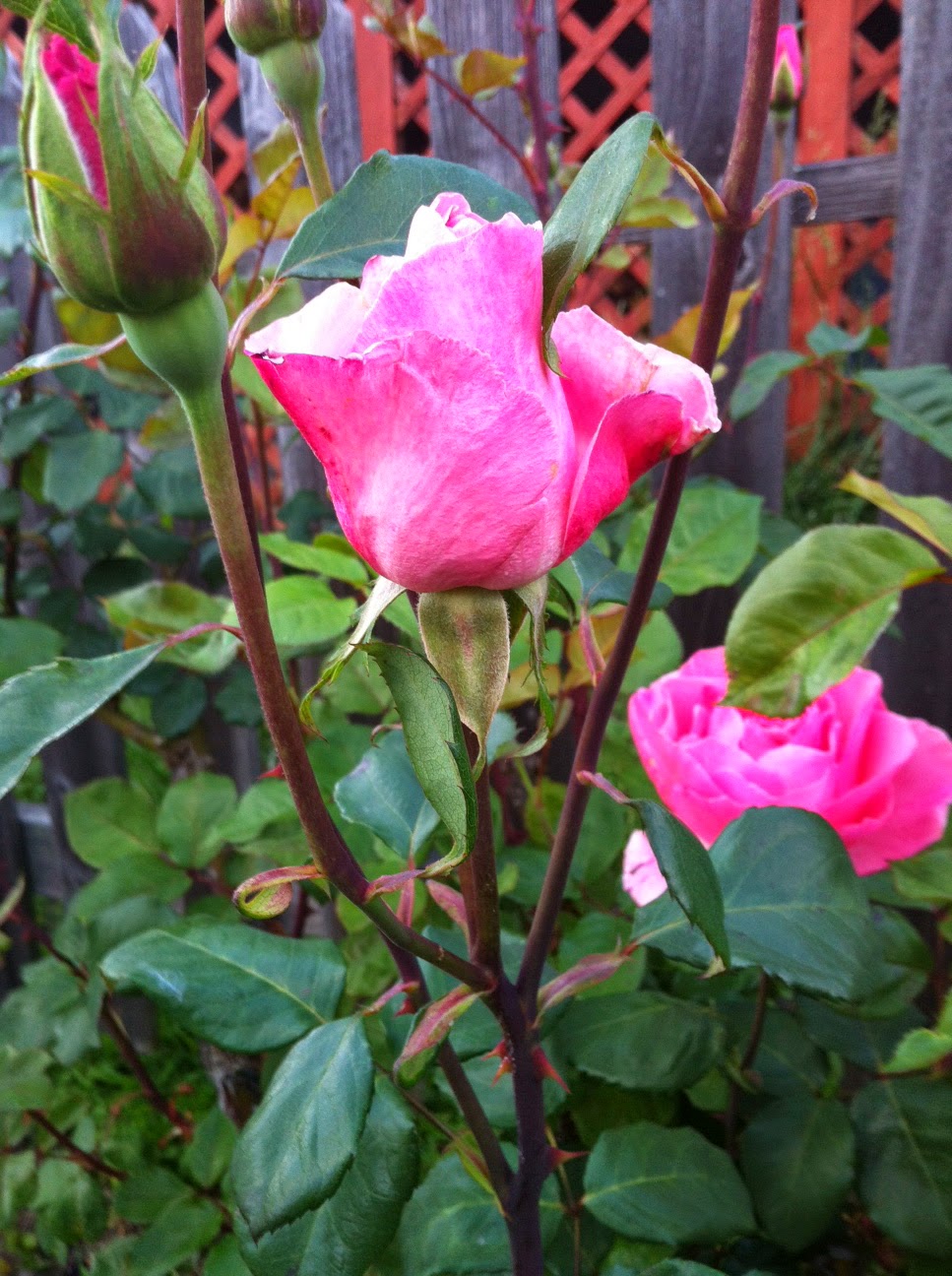
We are blessed to have nine different rose bushes as well as irises, calla lilies, fuchsias, rhododendrons and camellias surrounding our house. Indeed, we have an abundance of beautiful blooms throughout the entire year, especially during the month of April when all of them are in bloom at the same time. They get plenty of sunshine and clean air, and as we are aware that northern California is in a drought, we are mindful not to be careless in how much we water our flowers and plants.

And, so, in celebration of Earth Day, as I do so often throughout the year, I grabbed my camera and took lots of photographs, recording these colorful moments in our garden for others to appreciate and enjoy. Consider it  as my random act of kindness. 

May every day be like Earth Day to us.

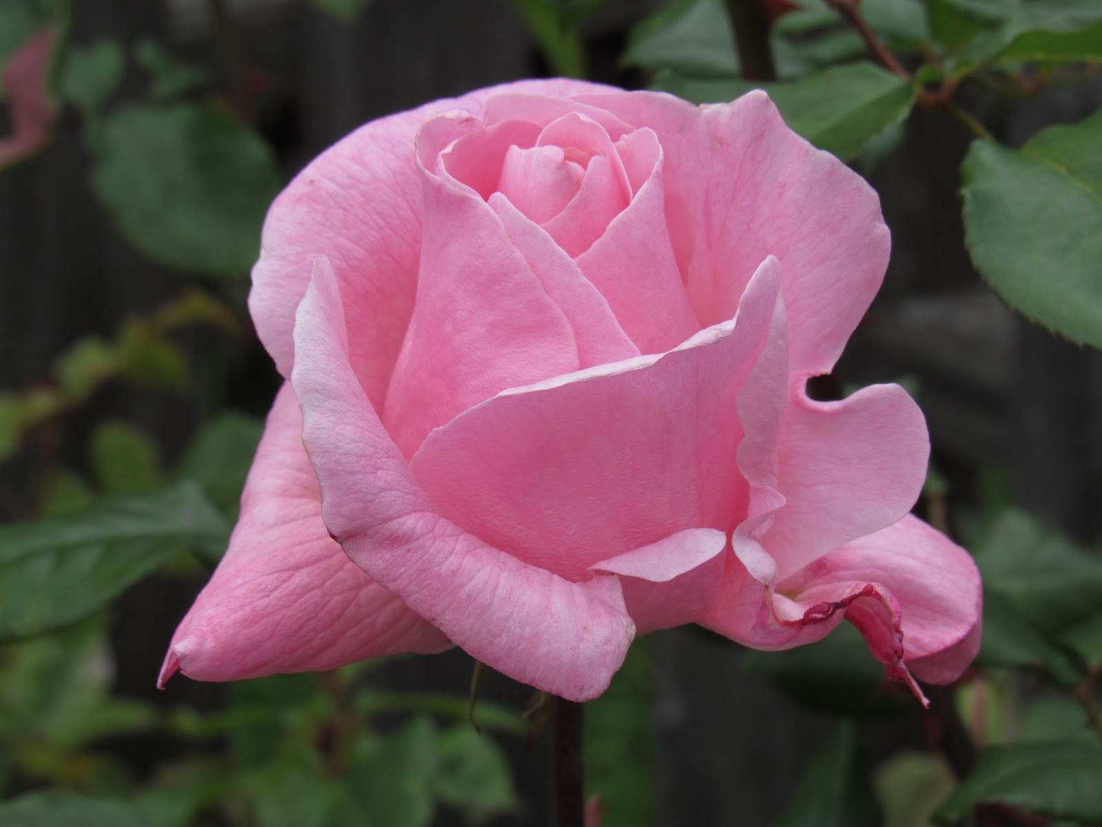
Queen Elizabeth rose

All That Jazz rose

Purple rhododendron

Calla lily

Rainbow-colored rose

All photographs © Michael Dickens, 2016.


Thursday, September 3, 2015

Shaping the world view of wide-eyed optimists


The Mindset List /
The Class of 2019 Mindset List will make you feel old.

Each year around this time since 1998, Beloit College releases the Beloit College Mindset List, which provides a close up look at cultural "touchstones" that shape the lives of students entering college.

I took a particular interest in this year's Mindset List as I have a niece and a friend, the son of our best friends from Seattle, Washington -- born a day apart in September 1996 -- who are both incoming freshmen in the Class of 2019. One stayed close to their Minnesota roots to attend community college while the other was accepted for admission by a well-known university in Boston.

For those of you not familiar with Beloit College, it's a private liberal arts college located in Beloit, Wisconsin that was founded in 1846 by a Yale University graduate, Aaron Lucius Chapin. Beloit College is recognized for its longstanding commitment to curricular innovation.

Among the cultural touchstones shaping the lives of students entering college this fall include:

• There's always been Google.

• They have grown up treating Wi-Fi an entitlement.

• Poland, Hungary and the Czech Republic have always been members of NATO.

• They have never licked a postage stamp.

• Color photos have always adorned the front page of The New York Times.

Vote-by-mail has always been the official way to vote in Oregon.

• They have avidly joined Harry Potter, Ron and Hermione as they built their reading skills through all seven volumes.

Hybrid automobiles has always been massed produced.

The Lion King has always been on Broadway.

• First responders have always been heroes.

The Class of 2019 enters college this fall with high technology playing an increasing factor in how and even what they learn, according to Charles Westerberg, Director of the Liberal Arts in Practice Center and Brannon-Ballard Professor of Sociology at Beloit College.

"They will encounter difficult discussions about privilege, race, and sexual assault on campus," Westerberg said. "They may think of the 'last century' as the twentieth, not the nineteenth, so they will need ever wider perspectives about the burgeoning mass of information that will be heading their way. And they will need a keen ability to decipher what is the same and what has changed with respect to many of these issues."

Critics of the Mindset List call it "a poorly written compendium of trivia, stereotypes and lazy generalizations, insulting to both students and their professors, and based on nothing more than the uninformed speculation of its authors." The website Beloit Mindlessness said: "It inspires lazy, inaccurate journalism and is an embarrassment to academia."

To its credit, the Mindset List has generated a book: The Mindset Lists of American History: From Typewriters to Text Messages, What Ten Generations of Americans Think is Normal was released in July 2011. It has a Facebook page that's been liked by more than 5,000 fans. And, it's been the subject of attention on broadcast news on The NBC Nightly News and in print in Time. 

Like it or loathe it, the 50 items which comprise the Class of 2019 Mindset List will make you feel old.

Tuesday, November 18, 2014

Grace Cathedral at 50: Defining beautiful architecture


A San Francisco sacred space / Grace Cathedral turns 50 this week.

How does one define beautiful architecture?

"Space has always been the spiritual dimension of architecture," the 20th century Canadian architect and urban planner Arthur Erickson once said. "It is not the physical statement of the structure so much as what it contains that moves us."


Grace Cathedral is the third
largest Episcopal cathedral
in the United States.
One of my favorite spaces in the entire world -- and one that I've experienced many times during the past two decades -- sits tall atop Nob Hill in San Francisco. The vibrant city's famous cable cars pass by it on the California Street side of this sacred space. It's a place that I return to often on Sundays, especially during Lent for Easter Sunday and in the season of Advent to worship on Christmas Eve. 

That space is Grace Cathedral, a place to explore; a place to go deeper in one's faith. It is the third largest Episcopal cathedral in the nation, and this week, Grace Cathedral turns 50.

Each time I climb the staircase that frames the cathedral's entrance on Taylor Street and enter this sacred space, I am moved by the beauty of the cathedral's French Gothic architecture, designed by Lewis P. Hobart; the Ghiberti Doors that are opened for special occasions; and the vaulted ceiling arches. There is much to admire in this exalted sacred space -- and photograph, too.


The Keith Haring AIDS Chapel altarpiece.
There's the lyrical Rose window above the main entrance with its the colorful prism-like reflections of light beaming through it and through the stained-glass windows, bathing the pillars and indoor labyrinth in beautiful colors.

There's the historical aisle murals that were painted by Polish painter Jan Henryk De Rosen between 1949-1950 and composed in a style blending the stylistic elements of early Italian masters Giotto and Mantegna.

And, there's the Keith Haring AIDS Chapel altarpiece.


Colorful prism-like colors beam
through the stained-glass
windows onto the indoor
labyrinth at Grace Cathedral.
Cathedrals have long been places of pilgrimage, and Grace Cathedral is celebrating its past, its present and its sustainable future. Work was begun on the present cathedral structure in 1928 and its completion and consecration took place in 1964. Duke Ellington performed his televised Concert of Sacred Music inside Grace Cathedral on September 26, 1965.

I enjoy worshiping at Grace Cathedral, absorbed by its sacred space, which is defined by the beauty of its art, including its medieval and contemporary furnishings. There's also the echoing sound of the majestic Æolian-Skinner pipe organ; the 44 bell carillon, and the harmonious voices of the Choir of Men and Boys.


Archbishop Desmond Tutu.
Of course, the homilies are meaningful, whether delivered by the Dean of the Cathedral, a visiting theologian, or by a guest homilist such as Archbishop Desmond Tutu, the anthropologist Dr. Jane Goodall or the playwright Anna Devere Smith.

And, they are always thought provoking, too.

Marcel Proust wrote how "Love is space and time measured by the heart." 

In Grace Cathedral, a house of prayer for everyone, I find solace here each time I visit.

And I know God's generous love awaits me.

To learn more about Grace Cathedral:

All photographs by Michael Dickens, © 2014.

Tuesday, May 6, 2014

Here's to our colorful May flowers


Pristine rose / The beauty of our May flowers

It's the first week of May and our backyard garden has started to bloom. Lots of colors -- orange, white, pink, red, purple.

Mr. Lincoln red rose
Looking back, the April showers we enjoyed here in the San Francisco Bay Area, indeed, brought an abundance of May flowers to our garden. Our Queen Elizabeth, First Prize and Pristine roses are blooming very nicely. The same for our Mr. Lincoln, white, orange and rainbow-colored roses. Just the other day, I witnessed our first All That Jazz bloom of the season  -- a lovely shade of red.

And, let's not forget that this is the time of the year our purple irises are blooming, too.

For most of us, flowers are an important part of our every-day lives. They have the ability to make us happy and cheerful. And, we offer our friends and loved ones flowers as a means of showing our sympathy.

Different types of flowers can express different kinds of feelings and emotions, from birthdays to graduations to weddings to funerals.

Queen Elizabeth roses
One thing's for sure: May flowers are a wonderful sight to behold -- and, I would would like to share with you a few of our May roses, which I photographed during the first few days of May.

Finally, let me leave you with this thought about flowers that's just as meaningful now in the 21st century as it was when it was written near the end of the 18th century:

"'Tis my faith that every flower
Enjoys the air it breathes!"

-- William Wordsworth, "Lines Written in Early Spring"
From Lyrical Ballads (1798)

Tuesday, October 22, 2013

Autumn colors: Let's take a road trip


Road Trip # 1 scarf / Inspired by autumn colors.

Inspiration comes in all forms, shapes and colors. Sometimes, it comes from an appreciation of our natural world observed while taking a road trip by automobile.

"The leaves had not really started to change to other colors rather having mellowed to old greens as they prepared for true autumn," remembered Babs Ausherman, known throughout the online yarn and fiber community as "Miss Babs".

A year ago, Ausherman was in search of natural surroundings to nurture her creative side as a fiber artist. Her "road trip" by car led her through the scenic and colorful mountains of Tennessee.

"The roadside grasses had gone tan with burgundy/russet seed heads, the sky was clear and blue," Miss Babs observed.

What she chronicled in vivid detail became the inspiration for a lovely, autumn-colored scarf design she created last year. The notes she wrote for the pattern read like a travelogue.

A hard-working, insightful fiber artist, Ausherman is the owner of Miss Babs Hand-Dyed Yarns & Fibers, Inc., an online retailer of hand-dyed yarn and fiber and patterns based in Mountain City, Tenn., the county seat of Johnson County, located in the northeasternmost corner of the Volunteer State. She was raised in a family of creative types and entrepreneurs. Miss Babs believes a good day's work is good for the soul.

I've had the pleasure to renew acquaintances with Miss Babs each of the past several years when she comes to California for Stitches West, an annual yarn and fiber expo held each February in Santa Clara. I've come to appreciate her sharp wit, artistic and creative flair, and thoughtfulness.

As I gazed upon the completed "Road Trip #1" scarf while perusing the Miss Babs booth at Stitches West earlier this year, immediately, I fell in love not only with the beautiful palette of autumn colors, but also with the design and feel of the scarf.

The Road Trip #1 scarf / 
Each section represents
the colors of the land and sky --

and it's a wonderful project
to knit on a road trip.
There are five colors that comprise the "Road Trip #1" scarf: "The original scarf is knit in Moss, Russet, Candied Pecan, Wheaten, and Coos Bay. The scarf takes a full skein of one color, and partial skeins of the other four colors," writes Miss Babs in describing the scarf on Ravelry, an online social media site for knitters and fiber artists.

"The sections represent the colors of the land and sky, but they also seem to be reminiscent of the concrete roads that we sometimes travel on. They make a thumpity-thump rhythmic sound," she adds in describing the scarf's design. "In addition to being inspired by the colors of a road trip, this scarf is a wonderful project to knit on during a road trip, since it is all garter stitch!"

My wife, who has knitted several scarfs for me, respects my taste in knitted arts. So, the "Road Trip #1 scarf seemed a natural fit. Because of its unisex pattern, I hinted that I would love to have one of these "road trip" scarves for my very own. Without hesitation, we purchased a copy of the pattern and picked out the requisite skeins of Heartland Worsted hand-painted 3-ply Merino yarn, much to the delight of Miss Babs.

My very own
Road Trip #1 scarf.
Fast forward through the remainder of winter, spring and summer to a few weeks ago. Just in time for autumn, I now have my completed scarf that's filled with its own autumn colors. During the time my wife knitted this project, it was both interesting and enjoyable to see my very own "Road Trip #1" scarf take shape, color by color and section by section. The finished scarf looks just as beautiful as the pictures that illustrate the easy-to-follow pattern.

Looking ahead, the Stitches West 2014 show is only a few months away, and I'm looking forward to attending so I can show off my "Road Trip #1" scarf for Miss Babs. I'm confident she'll be pleased by how it turned out. Now, if only I can find the time to go on a road trip.

All photographs of the Road Trip #1 scarf by Michael Dickens, copyright 2013.

Wednesday, September 11, 2013

On art: Richard Diebenkorn, The Berkeley Years, 1953-1966


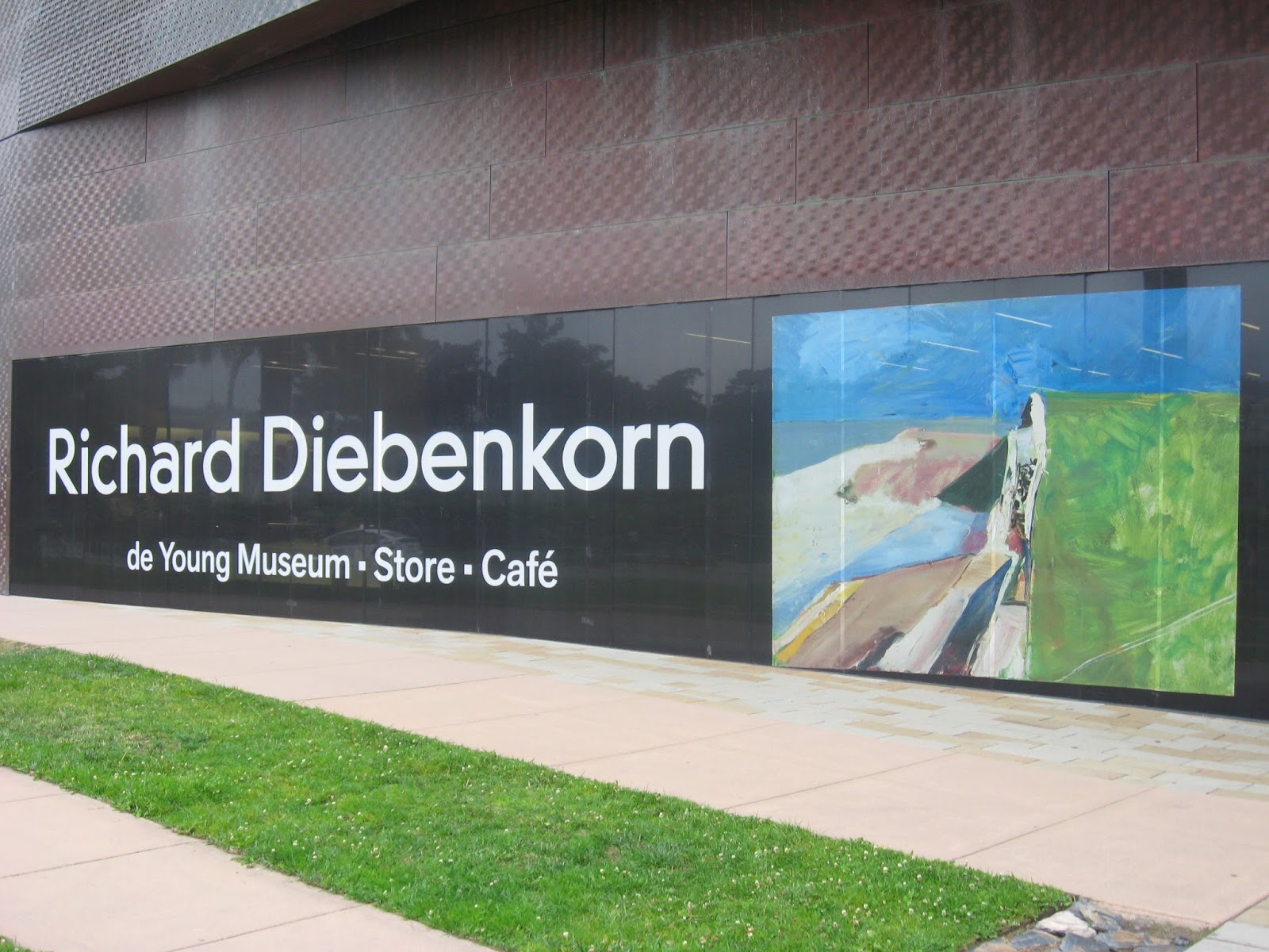
Richard Diebenkorn was profoundly influenced by the nature and culture of the San Francisco Bay Area. Color, light and atmosphere played a significant role in many of the 20th century American artist's works that are on view in Richard Diebenkorn: The Berkeley Years, 1953-1966, at the de Young Fine Arts Museum in San Francisco's Golden Gate Park through September 29.

The exhibition, which had its debut in June, is the first of its kind to focus on this pivotal period in the career of this postwar American artist.

During his lifetime, Diebenkorn (1922-1993) achieved acclaim as one of the most significant and influential artists of California and of postwar America. His early work is associated with Abstract expressionism and the Bay Area Figurative Movement of the 1950s and 1960s.

At the beginning of this exhibition of more than 130 paintings and drawings that were assembled from museums and private collections across the country, we get to go outside the lines to get a feel for what's going on in Diebenkorn's mind as he shares his thoughts in Notes to myself on beginning a painting:

  • Attempt what is not certain. Certainty may or may not come later. It may then be a valuable delusion.
  • The pretty, initial position, which falls short of completeness, is not to be valued -- except as a stimulus for further moves.
  • Do search. But in order to find other than what is searched for.
  • Use and respond to the initial fresh qualities, but consider them absolutely expendable.
  • Don't "discover" a subject -- of any kind.
  • Somehow don't be bored -- but if you must, use it in action. Use its destructive potential.
  • Mistakes can't be erased, but they move you from your present position.
  • Keep thinking about Pollyanna.
  • Tolerate chaos.
  • Be careful only in a perverse way.

Richard Diebenkorn /
Seated Figure with Hat, 1967,
oil on canvas.
Much of the art in Richard Diebenkorn: The Berkeley Years, 1953-1966 is devoted to a three-year period in which Diebenkorn "painted prolifically, his paintings, watercolors, and drawings synthesizing elements of nature with an abstract approach in what came to be known as his Berkeley series," according to the de Young's Fine Arts magazine, in previewing the show. Later in the exhibition, we see Diebenkorn's subsequent figurative phase, and it is easy to see and understand why he had a profound influence on American modernism.

As I walked through the exhibit rooms on a recent Friday evening, studying and absorbing Diebenkorn's artwork, my attention was drawn to several of the artist's quotes that were prominently displayed on the gallery walls. I took the time to read each of them carefully:

  • "Abstract means literally to draw from or separate. In this sense, every artist is abstract ... a realistic or non-objective approach makes no difference. The result is what counts."
  • "All paintings start out of a mood, out of a relationship with things or people, out of a complete visual impression."
  • "I began to feel that what I was really up to in painting, what I enjoyed almost exclusively, was altering -- changing what was before me -- by way of subtracting or juxtaposition or superimposition of different ideas."
  • "It was impossible to imagine doing a picture without it being a landscape; to try to make a painting space, a pure painting space, but always ending up with a figure against a ground."

After its San Francisco premiere, Richard Diebenkorn: The Berkeley Years, 1953-1966, will move to southern California and be on view at the Palm Springs Art Museum from October 26, 2013, to February 16, 2014.

To learn more about the Richard Diebenkorn exhibition at the de Young: http://diebenkorn.famsf.org/

Photograph of de Young Fine Arts Museum by Michael Dickens, 2013.
Photograph of Richard Diebenkorn's Seated Figure with Hat, 1967, courtesy of Wikipedia Commons.

Tuesday, April 16, 2013

A monument to change that's always changing


Hundreds of colorful Post-It notes?

Not quite.

Instead, what caught my attention as my wife and I happened upon the American artist Peter Wegner's never-ending "Monument to Change as It Changes" on a recent, northern California spring evening was this: it's an unusual yet thought-provoking monument of colorful patterns and images that's perpetually in flux.

One moment, the 2,048 tiles comprising "Monument to Change as It Changes" are mostly blue with shades of green. Another moment, it's turned red accented with yellow, and so on. There's a fluttering sound heard as each of the tiles flips and changes color.

The massive, three-ton wall monument, which made its debut in 2011, is a 32-foot-wide large grid of colorful flip tiles built into the facade of Zambrano Hall at Stanford University's Graduate School of Business campus.

The flip-digit technology that enables each tile to change colors ~ including blues, reds, yellow, greens, purples ~ is reminiscent to the way letters change on old-fashioned European train station departure and arrival boards. And, not surprisingly, this mesmerizing artwork was designed so that no color patterns repeat during an eight-hour cycle.

During my 10-minute visit, I stood transfixed by the ever-evolving color patterns and the cadence of sound as I tried to shoot photographs of this artistic moving monument.

Sometimes, it takes provocative beauty to make us pause and think about big thoughts.

Monument to Change as it Changes /
Always colorful and perpetually in flux

Photograph of "Monument to Change as it Changes" by Michael Dickens, copyright 2013. 
Video courtesy of Stanford Graduate School of Business, copyright 2011.